With snippets about how to launch and build a brand
Not every talent gets sharpened or as we say, is able to #GetTheEdge. You look at the world around you, it is rather obvious that there is no dearth of talent or aspirations in people. What people are missing is the lack of right guidance or sharpening of the skills. Every human being has ambitions. Ambition to get ahead, to move up in life, to provide a better life to his or her family or to even change the way the world works. Yet, the number of ambitions that go unfilled is rather crazy.
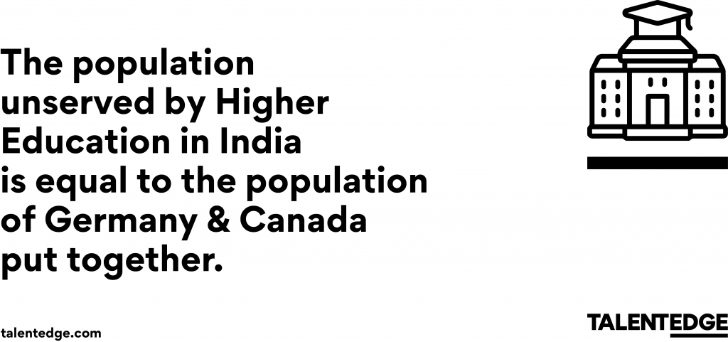
In India, the Gross Enrolment Ratio for the Higher Education segment is a measly 27.4%. In 74 years of our Independence. That means approximately 40 Million people in the age group of 21-25 get a University degree.
What this means is that over 109 Million people in the age group of 21-25 do not have access to higher education in India.
Imagine what could happen to their dreams, their aspirations if every single one of them got access to high-quality higher education. Imagine what could happen to our society and our nation and to the world at large as India’s Gross Enrolment Ratio moves upwards to 30% or 40% or 50% over time.
This is in addition to millions of professionals (about 60 million) who have the degree but may not have all the right skill for the modern world.
We wish to solve for this. We wish to give wings to dreams, aspirations and ambitions. We know we can’t solve for everything ourselves but as long as we can drive outcome-based education that promotes inclusivity and do it with crazy amounts of energy and passion, we could all tell fabulous new stories of this hustle for times to come.

When we started the process of discovery to nail down our brand’s purpose even before we did anything else on the architecture or identity of the brand, I knew it’ll change us all. Finding a purpose always does. But finding a purpose for something that changes human lives can change anyone.
As someone who’s passionate about financial inclusion, health, food and education as the pillars that can transform any society or human lives, this rebranding of Talentedge was more than just a task or a job. It was about helping an organization and its people find the fuel, the purpose that defined their reason for existence.
I have spent years in Telecom, Fintech, Remittances, Edtech and have led marketing, business, growth marketing, product management, customer experience, research and more but truly this rebrand was life changing to say the least. Not just for me but for an equally passionate team that we have at Talentedge.com.
THE INITIAL BRAND BRIEF HAS ITS OWN STORY:
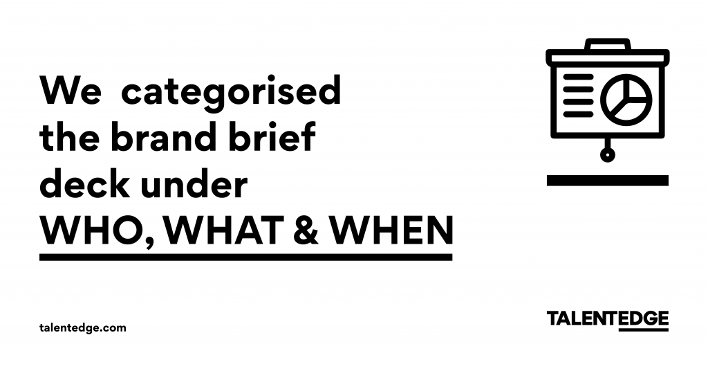
I came from a place that was all about having a blank slate to ensure there is no baggage. I decided to spend as much time as needed in crafting a brief that works and FAILED. I just couldn’t write a brief. What I came up with was a deck that went into over 100 pages but that had its foundation on the 3 steps below and which I categorize under WHO, WHAT and WHEN.

Who are we solving for? The journey started with a long and arduous task of identifying who we are serving and who we wish to serve. From data mining to talking to customers, I did it all as I wanted to be very sure about this. Nothing is more important than knowing who you are solving for. This isn’t just about data – it is about human emotions, habits, dreams, aspirations, ambitions, societal practices, culture and a whole lot more.
What we can be for them? Thereafter many debates ensued about what we wish to become. What can we do for our audience and how can we do it.This is all about having a long-term vision and this needed lots of research again about various global players, Indian players and how they are solving and what are the gaps.

When do we start to be what we can be? We looked at all our offerings yet again to see how our future play could start resonating with our vision.
I knew a 100 page deck isn’t going to inspire anyone and definitely can’t be called a BRIEF. Yet I needed to share my passion and energy about building this brand in the manner that I felt in my heart. I decided that instead of a regular “let’s send the brief out”, I’d meet people and tell the unique story that we wish to build.
To convey the same passion not just through the written words but also through my own energy. That to me was how I first started to live the new brand in my own head even before it was born.
Finally, after many passionate sessions, we had Alok Nanda and Company who we went ahead with for our rebrand and to discover the purpose that we wish to convey.
FINDING OUR PURPOSE & CREATING THE NEW IDENTITY: HICCUPS AND MORE
The first step in this journey was to have our investors, the board members, the leadership team and all stakeholders interact with the design team that was led by Alok.
From insights to inputs to our own ambitions, we laid it bare. We shared from our heart and mind and some of us, like me, from our soul too.
Eventually, post the discovery phase, we had the insights coming through based on the 100 page “brief”, the sessions and the crazy pings and madness that I sent via emails to the team. We knew we were on to something purposeful for our purpose.
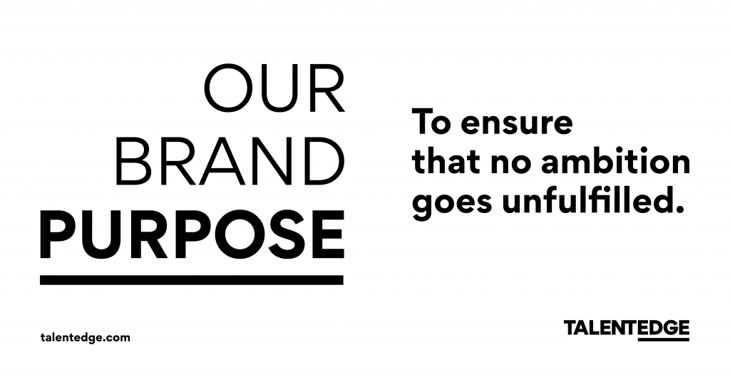
These insights led us to the final words that in more ways than one convey what to us is our core and to me what I genuinely felt when I started the journey.
“To ensure that no ambition goes unfulfilled”.
What sounds simple, never is. Translating this into a positioning statement, brand Identity and expressions is no small task.
It meant we had to go back to the insights and look at who were serving and then be relevant to them all. Every single one of them. “The problem and the opportunity – we’ve got customers in the age-group of 18 years to 60 years with offerings that serve varied interests, domains and needs”
Challenge after the Brand Purpose: How do we create something that’s relevant, meaningful, eye-catchy, modern and yet has the seriousness and authority needed to convey our brand’s purpose “To ensure that no ambition goes unfulfilled”.
We serve as an OPM for universities and we also provide executive certifications across the widest range of Domains in India.
How do we ensure every single one of our offerings could convey the same ethos, visual identity and tone and manner of voice and still be relevant for all while having a brand identity that conveyed our positioning within the logo itself.
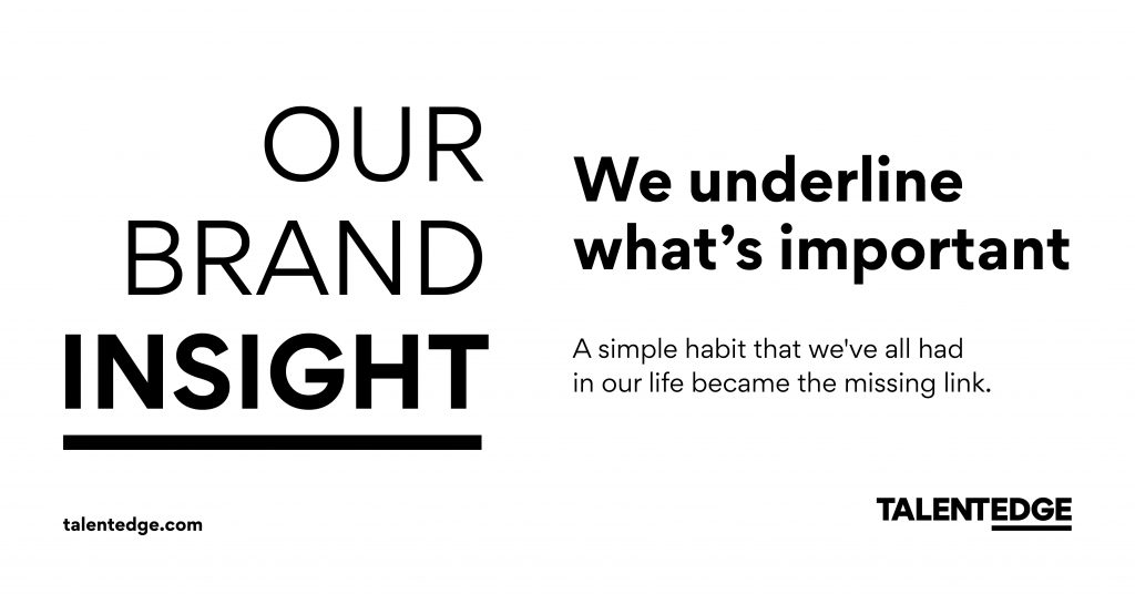
Simplicity and a simple insight came to the rescue yet again.
A simple habit that we’ve all had in our life became the missing link.
Every time when we read a book and we find something interesting or important in a book or a note, we do a simple thing. All of us have done that.
We UNDERLINE what’s important.
We do it coz we believe that reading and practicing or remembering those few words will help us #GetTheEdge. This is what we decided to use not just for our unique Identity but even for brand expressions.
We know what we’re solving for is a huge problem and hence a huge opportunity. You need to be able to therefore have a perception of authority while also being able to stay modern and uncluttered in today’s complex, content heavy world.
While the story is way too long, this simple insight combined with the positioning that we seek to build over time led to the new Brand Logo that you see here.
The Logo is a reflection of the belief that I mentioned earlier. It resonates with our belief that EVERY human being has innate talents. What is important is to acquire the EDGE. A simple but authoritative representation of our belief our purpose and our positioning that we wish to craft over a period of time.
As consumers there’s way too much content bombardment around us and that adds complexity. So staying SIMPLE was vital.
Once this identity was finalized, and believe me it was not an easy one as there were other options too which looked “seemingly more attractive”, came the journey of crafting the brand expressions.
TIME TO EXPRESS:
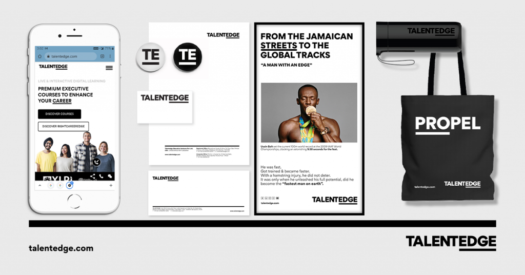
Photography, imagery, icon styles, illustrations, fonts, tone and manner of voice, and visuals all needed to be crafted now keeping the purpose, the positioning, and the identity that we wanted to craft.
We decided to have a tone and manner of voice and visuals in a manner that could show forward movement while the imagery needed to be inclusive and playful in the way it could be used. Everything inspired by the Brand Purpose. The typography with Gordita as the lead font is clean and simple and easily legible across screens and devices.
YOU DON’T HAVE A COLOR PALETTE? WHAT DOES THAT MEAN?
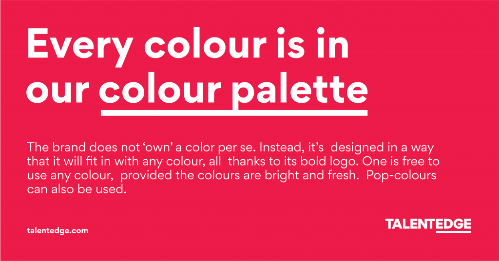
Education is all about Inclusivity and outcomes for us which means we have to be nimble, inclusive and fluid. But brand color palettes are rigid. So we decided to be fluid and inclusive over being rigid. We decided to let our expressions to be a reflection of our beliefs.
We decided NOT to have a color palette for our communication.
The idea is to not be bound by a color palette and allow the brand to express itself in a varied set of colors. Just like there are various kinds of talents and beliefs and nature too has diversity, so will our creatives.
With these guard rails, we decided to PLAY and have some fun while staying true to our purpose of ensuring that no ambition goes unfulfilled. We were still going about our regular work and preparing the brand for an eventual rebrand too which meant identifying the hundreds of touchpoints with prioritization for change and finalizing a date and when we can switch and then BOOM. One call led to a decision whereby a call was taken to launch the new brand in 7 days. Yes you read that right. Rebrand in 7 days. There were hundreds of touchpoints across digital to offline and office to people and our voice too.
What would probably scare the normal being, it is loved by the ones with passion and madness in them. No wonder people with passion and new ideas are called crazy till they make the world a better place.
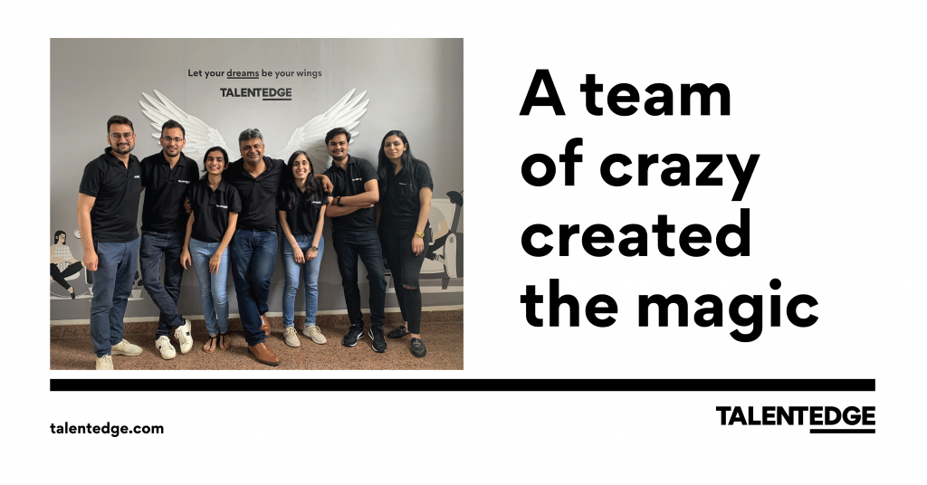
In 7 days, a team of crazy people converged in an “Ambition room” to build and Execute the fastest rebrand plan that I have been a part of.
You know the craziest and the most awesome part? The youngest person was given the massive responsibility to act as the hub around which everyone would pivot including me. As a team, we knew this was for the best and you bet it worked like a dream.
With offices across 3 cities, 2 of them with time restrictions due to COVID and vendors and workshops running on lower capacity due to a shortage of people, this was one that challenged every part of us. We did overcome them all one by one. Not as individuals but as a team.
What you see now of Talentedge is work that is from the heart for those dreamers who challenge the status quo of their life by getting the edge and who are satisfied with destiny and create new destinations.
Let us celebrate those dreamers and help every Talent to #GetTheEdge.
THE NEW LOGO REVEAL
I also wanna celebrate the dreamers within specially this bunch of crazy – Parinaaz Saini, Deepak Singh Bisht, Chirag Talwar, Aditi Tiwari and supported ably by Vikas Singh Rawat, Shreya Singh, Ashis Mohanty and his team, Hemant and every one who helped us attempt the craziness that we did across so so so so many touchpoints that even checklists started needing checklists.
From leaders of the company to the team working behind the scenes, it is time to let no ambition go unfulfilled. Let’s live this purpose and there’s no back button here.
There’s much to do, many mountains to climb and many ambitions to be fulfilled. Let’s not rest and keep living our brand purpose in all we say and do.
Penned By:
Abhinav Upadhyay
CMO – Talentedge


